rc-tabs
React Tabs component.


Screenshot
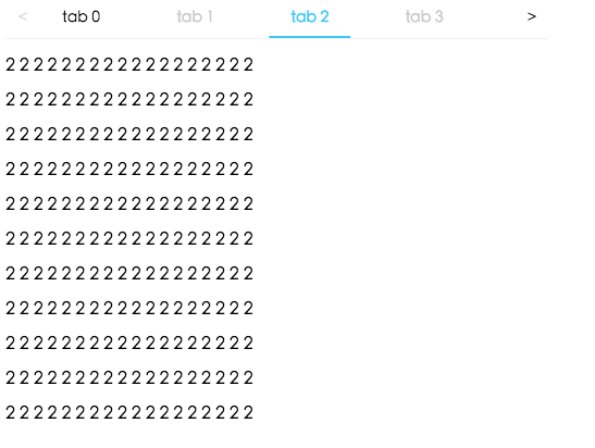
Example
http://localhost:8000/examples
online example: https://tabs.react-component.now.sh/
install
Feature
Keyboard
- left and up: tabs to previous tab
- right and down: tabs to next tab
Usage
import Tabs, { TabPane } from 'rc-tabs';

var callback = function(key) {};

React.render(
  <Tabs defaultActiveKey="2" onChange={callback}>
    <TabPane tab="tab 1" key="1">
      first
    </TabPane>
    <TabPane tab="tab 2" key="2">
      second
    </TabPane>
    <TabPane tab="tab 3" key="3">
      third
    </TabPane>
  </Tabs>,
  document.getElementById('t2'),
);
API
Tabs
| name | type | default | description |
|---|---|---|---|
| activeKey | string | - | current active tabPanel's key |
| animated | boolean \ | { inkBar: boolean, tabPane: boolean } | { inkBar: true, tabPane: false } |
| defaultActiveKey | string | - | initial active tabPanel's key if activeKey is absent |
| destroyInactiveTabPane | boolean | false | whether destroy inactive TabPane when change tab |
| direction | `'ltr' | 'rlt'` | 'ltr' |
| editable | { onEdit(type: 'add' | 'remove', info: { key, event }), showAdd: boolean, removeIcon: ReactNode, addIcon: ReactNode } | - |
| locale | { dropdownAriaLabel: string, removeAriaLabel: string, addAriaLabel: string } | - | Accessibility locale help text |
| moreIcon | ReactNode | - | collapse icon |
| tabBarGutter | number | 0 | config tab bar gutter |
| tabBarPosition | `'left' | 'right' | 'top' |
| tabBarStyle | style | - | tab nav style |
| tabBarExtraContent | ReactNode \ | { left: ReactNode, right: ReactNode } |
- |
| renderTabBar | (props, TabBarComponent) => ReactElement | - | How to render tab bar |
| prefixCls | string | 'rc-tabs' |
prefix class name, use to custom style |
| onChange | (key) => void | - | called when tabPanel is changed |
| onTabClick | (key) => void | - | called when tab click |
| onTabScroll | ({ direction }) => void | - | called when tab scroll |
TabPane
| name | type | default | description |
|---|---|---|---|
| key | string | - | corresponding to activeKey, should be unique |
| forceRender | boolean | false | forced render of content in tabs, not lazy render after clicking on tabs |
| tab | ReactNode | - | current tab's title corresponding to current tabPane |
| closeIcon | ReactNode | - | Config close icon |
Development
npm install
npm start
Test Case
npm test
npm run chrome-test
Coverage
npm run coverage
open coverage/ dir
License
rc-tabs is released under the MIT license.